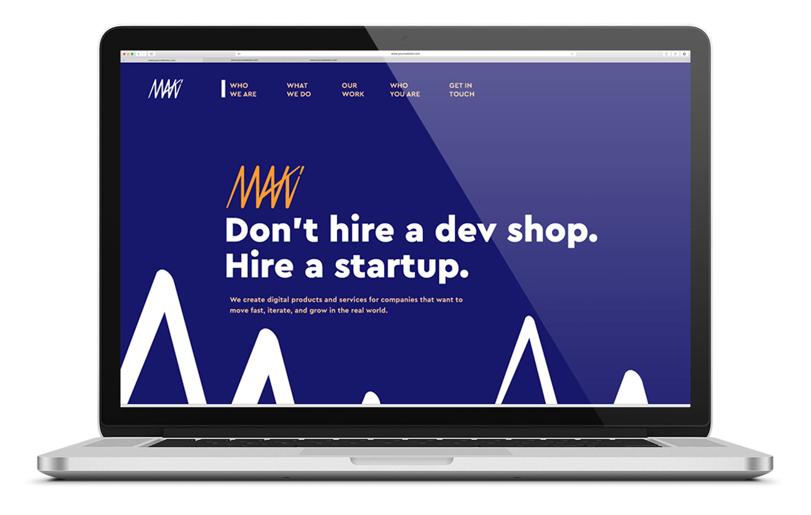
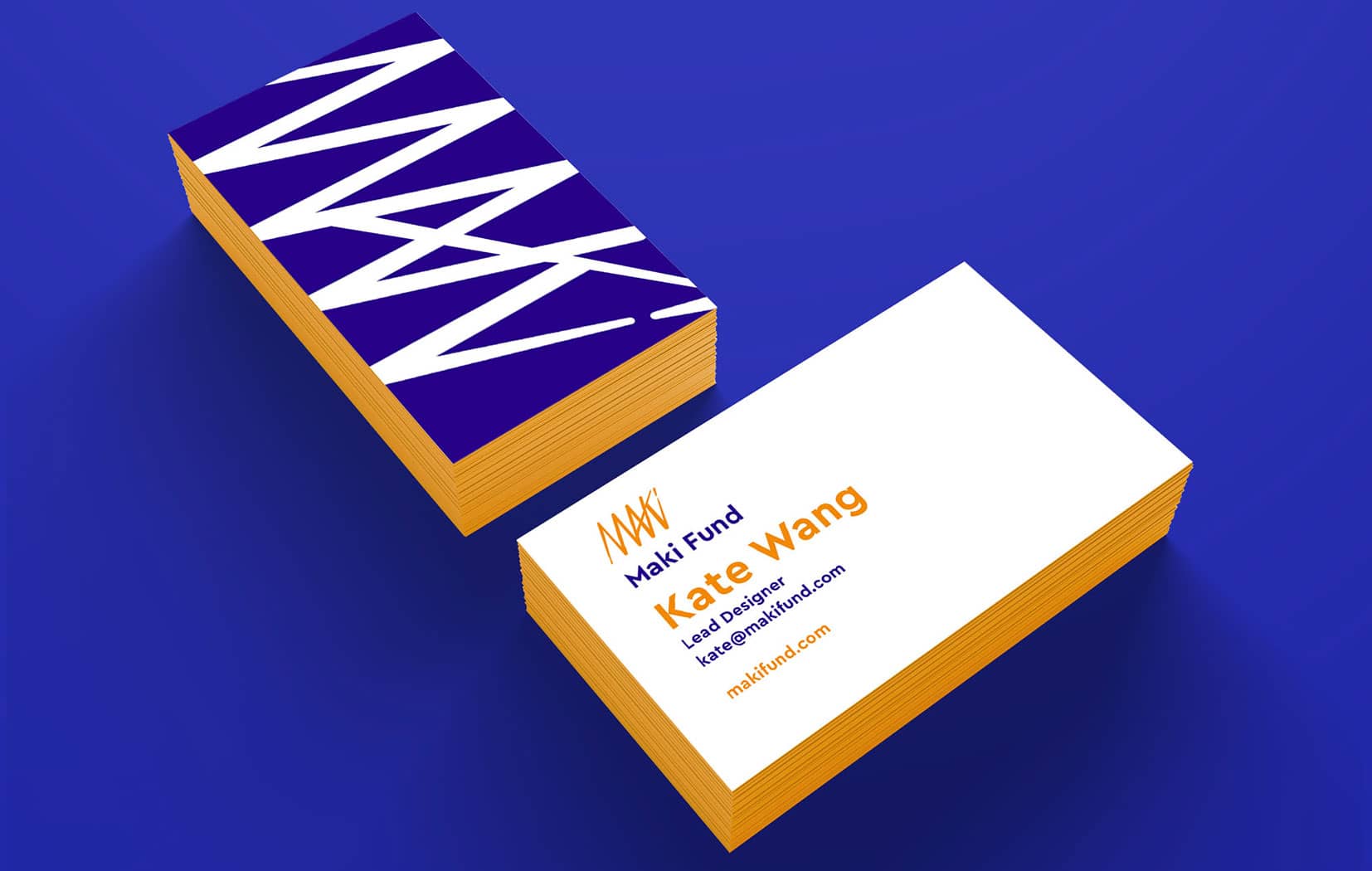
The Maki Fund, known colloquially as Maki, is a software company that focuses on startup centric websites and applications. They believe great software is like great sushi; made fresh, made fast, and it makes people happy. Maki specializes in Ruby on Rails and work with most back-end and front-end technologies.
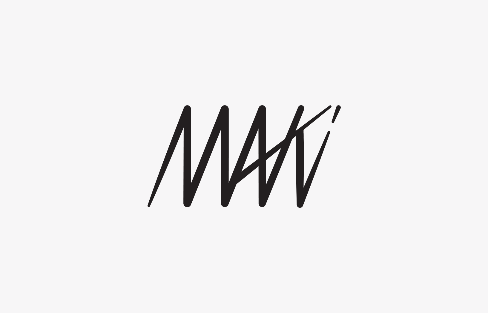
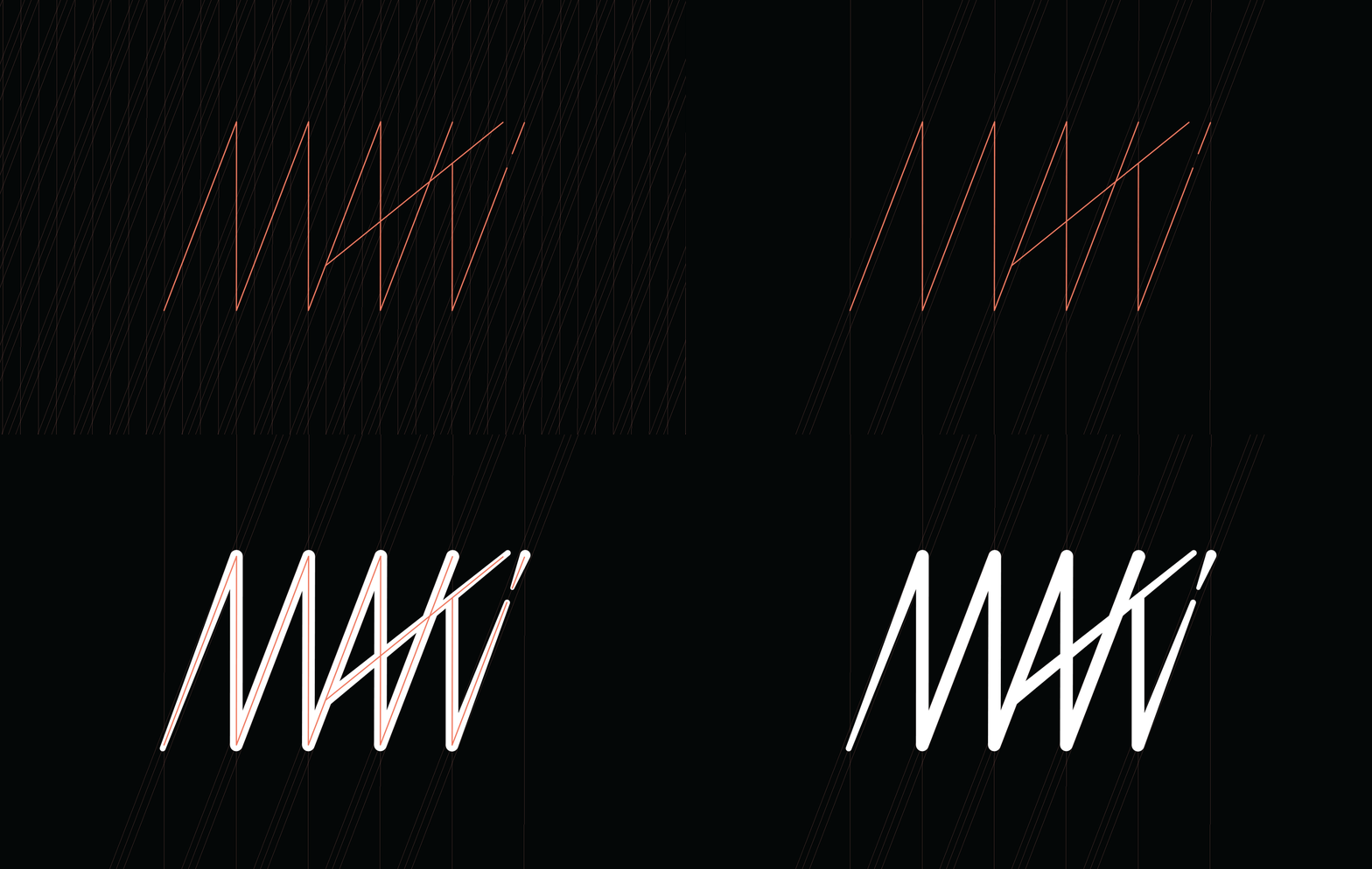
The concept for the identity is based on the back and forth tail motions of a swimming fish. It was important to balance the zigzagged shape on a grid to achieve an appropriate geometric harmony. The task was cumbersome but imperative as to clarify the Maki letter forms for increased legibility.
CLIENT : MAKI FUND
PROJECT TYPE : BRANDING